Monday, August 19, 2019

August Layout Roundup

I've not been very good about getting these posts done, so I've decided that the easiest thing to do is create a once a month blog post for my CSI work. Since I'm not currently employed, you'd think that I would have tons of time to do it and I guess really I do. But I find that this little blog sinks to the bottom of the priority list quite regularly. So I'm going to simplify the process and post once a month.

Here's Case #292 Freestyle Prompts from CSI : Color, Stories, Inpsiration :


And the Traditional Case Files and Clues :


The beautiful, dreamy image is by watercolor artist Heatherlee Chan.


EVIDENCE

Stripes
Map print
Flowers, leaves
Frames
Watercolor
Ribbons
People embellishments
Fabric
Mesh
Metal
Circles
Stencils
Stamps
Stitching
Photo corners
Mix black and white patterns with more colorful patterns
Bling

TESTIMONY

Topic: Document a trip you’ve had or one you dream of.
Prompt Idea: Click the “Inspire Me” button at Daydreaming on Paper.
Presentation: Put your journaling inside a frame.
Writing Format: Write your journaling in the form of an itinerary
Inspiration Words: dream, far, border

THE SCHEME (RGB Codes)

116.200.221 – sky blue
255.255.251 – white
228.117.160 - bright pink
247.226.143 – pineapple yellow
116.170.108 – grass green


And here's what I made with it :


Recently, my Mom, sister and I all flew to Halifax, Nova Scotia from Toronto, Ontario together to visit my brother and his family and do some tourist-y stuff while we were there. This photo was taken while we were waiting to taxi onto the runway in Toronto.

Here's how I solved this Case:

COLOURS
All the colours are there.

EVIDENCE
Stripes
Map print
Flowers/leaves
Watercolour (in my bckground stamping)
Circles
Stamps
Mixing black and white with colourful patterns.

TESTIMONY
The TOPIC clue "Document a trip you’ve had or one you dream of" inspired this page.

Journaling
The journaling pulls out from under the photo with the little tab that says "Adventure" on it.

here we are waiting for the plane to leave toronto for halifax at the start of a memorable trip together, which of course was documented with the obligatory selfie by monica.

july 1st - 11th 2019

Here's a few quick closeups of this page :


Case #293 COLD CASE Freestyle Prompts :


And the Traditional Case File and Clues :


This stash-busting Cold Case features a whimsical Scene by French illustrator Veronique Petit.


Here's a few Product Clues to help get you started :

Find older papers that match some of the colors in The Scene.
Use older papers that have a number or text pattern.
Use older stickers.
Use never or rarely used stamps.
Use leftover numbers from your alphas.
Find some older “cute” stuff in your stash.
Use some old birthday-themed items.
Use some of your old or rarely used punches or dies.
Use a corner rounder.
Use ribbons.
Use those cut-apart cards that you haven’t cut into yet.
Magic number is 9—grab the 9th paper or embellishment pack (or something else) in your stash and start there.
Got any old products by Ki Memories? Use them!

And some Design Clues to help you create :

Create your layout using a grid design.
Use cut-apart cards (you know, the ones that are on a sheet of patterned paper)—use some whole and cut elements off of others.
Use number(s) as a major design element.
Add googly eyes to your title or numbers
Add small words to arrows and other elements on your page.

And here's what I created :


The grid style of the image inspred me, and the numbers made me think about birthdays this time. So I made this page to celebrate my son's 19th birthday, using my favorite photos of him throughout the years. Each wooden number represents his age at the time of the photo.

I chose to use blue, yellow, red and brown as my main colours. Some of the papers here have been in my stash for at least 5+ years! There's some old Jillibean Soup, Basic Grey & MME there.

I used the following Product clues to help me along :

Older papers
Paper with a number pattern
Leftover numbers (old bingo wooden numbers)
I used a corner rounder
I made 9 squares (ok, 8 squares and a rectangle...)

And from the Design clues I was inspired by the following :

Use a grid design
Use numbers as a major design element
Add small words and the idea of arrows.

Inspired by the #4 throwing the confetti (which was also happened to be the name of my blue patterned paper!!), I made some watercolour sprinkles behind all the photos on the page.

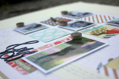
Here's a few closeups of this page :


Thanks for popping by and checking out my page today, I can't wait to see what you create with these cases!

Saturday, August 10, 2019

Sweet, Colourful You

If you've been following me at all you'll know my personal feelings regarding the colours pink and purple.

So when this new case from CSI : Color, Stories, Inspiration came up, it was even more of a challenge. I actually don't have that much to work with in regards to those 2 colours, but thanks to the SCT Sampler kit that I receive every month, I was able to pull this together.

Here's Case #291 Freestyle Prompts: :


And the Traditional Case File and Clues :


Our photo inspiration comes from this gorgeous image from digital artwork by Bloomsical.


EVIDENCE

Floral pattern
Stripes
Cameras
Globes
Travel-themed elements
Hot-air balloons or other transportation
Clouds
Flowers, leaves
Paint
Gold elements
Doily
Buckles
Hearts
Brush font lettering
Label
Swirly things
Nuvo drops (or something similar)
Ribbons, bows
Glitter

TESTIMONY

Topic: Document a trip you’ve had or one you dream of.
Prompt Idea: Get inspired by these August Prompts
Presentation: Write your journaling on a label.
Writing Format: Write your journaling as a Top 5 list.
Inspiration Words: wanderlust, fashion, art

THE SCHEME (RGB Codes)

138.73.129 – purple
217.178.204 – lavender
255.255.251 – white
244.216.205 – ballet slipper pink
2.2.2 – dark black


And here's what I made with it!


These pictures are from my youngest daughter's Grade 8 Graduation night. Everything that she wanted for her "look" was completely different than every other girl in her class - from the fauxhawk to the long dress and high heeled shoe, she's so colourful!


Here's how I solved this case:

COLOURS

All of the colours are there, plus I added in some light blue, and a brighter pink in addition to the scheme.

EVIDENCE
Floral pattern
Stripes
Flowers
Paint
Gold elements
Hearts
Brush font lettering
Label

TESTIMONY

I'm planning on making a TOP 5 List as suggested by the WRITING FORMAT clue. I was also inspired by the WORD : Fashion.


Here's some closeups :


Here's a closer look at the title area. Most of the product here is from Vicki Boutin. I used many pop dots in the creation of this page, but I really love the dimension that they bring. I mixed a tiny bit of Vicki's gold glaze with more of her iridescent glaze to get a "softer" gold colour for the stenciling. The photo doesn't really show how glittery it is IRL.


Many, many layers using many, many pop dots under the main photo on the page!


My favorite photo and the perfect embellishment!! She loves this "rockin' it out" pose and uses it often, so OF COURSE we had to do it at Grad too! Also a closer look at the "watercolour kissing" background work on the page, and more stenciling. I have to get better at planning my backgrounds first. There's way more kissed colour under the photo block that I ended up covering up!


And finally, just a couple of photos of some of the finishing touches - these are all just stickers, but they add just the perfect little something to this page.


This month, we have seven generous sponsors. Click HERE to read more about our sponsors and the prizes they are donating. Winners will be selected randomly from all of our players, with a few exceptions where sponsors have asked us to choose from certain geographic regions. Head on over to our CSI Scrapbook Challenge Page for more details and to participate!

Thanks for popping by today - I can't wait to see what you've created!!

Tuesday, July 30, 2019

Layout Roundup #2

The last 2 months have gone by in a whirlwind! The end of another school year, travel and general laziness have held me back from updating. Here's some of my recent work from CSI : Color, Stories, Inspiration.


For Case # 281 :


The "Document a favorite photo" Testimony prompt inspired this page this time. These photos were taken back in 2005 after my youngest daughters baptism. I treasure these photos even more now that my Dad has passed.

I loved the case colours but my blue colour is slightly darker than the swatch calls for. I also used the following evidence clues to help put this page together : plain white background, wood, cameras, winged things & labels.


For Case # 282 :


This June I retired from school bus driving after 18 years. While I'm not sure what I'm going to be doing next, I feel really good about this decision.

The "pleating" Evidence clue and the word "Change" from the Curious as a Cat website helped inspire this page. I tried to make the pleating look like a curtain being pulled back. While hard to see, there's a scene on the wood epoxy piece that has a horizon and clouds on it, and I felt it fitting for the subject of this page.

I also used the following Evidence clues to help bring this page together : Stripes, Diamond shapes, Other Animals, Something fuzzy, Brads, Clouds, Pleating & Metal Accents.


Somehow, I managed to skip June's cases entirely!! So, the next case that I created for was # 288 :


The inspiration word "Best" inspired this layout. When I saw it, I thought "Best Dressed" and it reminded me of these photos from my sons senior prom. He hates having his picture taken, but I made him anyways. This is his "are we done yet?" face. Using this colour palette for this page was easy, since his girlfriend made him wear pink (gasp, the horror!!!!) as their colour.

I used the following evidence clues to help solve this case : wonky dots & marks like the background patterned paper, stripes, circular elements, stars, triangles, & sprinkle something (the paint splatters in the background).

I also used a sketch from Jana McCarthy to design this page & hand stitched my triangles!

Here's a photo of the sketch in case you are inspired by it. I printed it out and cut the triangles apart. Then I used them as a template to cut triangles from my patterned papers.


And finally today, here's Case # 289 :


The scene really inspired me to document part of our 2011 family summer vacation. We went camping and as part of the trip, took the ferry across the Bay up north. The stamped tag on the left hand side that reads "Making Memories Together" pulls the journaling out from under the photo strip. All the colours are there, plus I added a bit of yellow, which was inspired by the door of one of the houses in the photo. i got to use some things that have been in my stash for a long time!

I also used the following evidence clues to help complete this page : Paper with a watercolour look, dots, stripes, sailboats, string, flags, eyelets, bows.

Thanks for popping by and checking out my blog today!

Tuesday, April 30, 2019

Muddy Boots and Happy Hearts

Every month Debbi over at CSI : Color, Stories, Inspiration has been putting together a "Cold Case". These cases are designed to help you resurrect some of the older product that you have floating around in your stash of goodies. This case is an optional one, but this month I decided to try to tackle it.

Here's the Case File and a closer look at the inspiration photo from this Cold Case. The scene from our whimsical April Cold Case is by Marie Desbons.


Here's a few Product Clues to help get you started :

Find older papers that match the colors
I don’t know about you, but I have a ton of bicycle embellishments and I’d love the opportunity to use them.
Use some of your old butterfly accents.
Remember when swirls were all the rage? Use them.
Surely you have a ton of flowers. Use them. Or use an old floral print.
Here’s an old brand to use: K&Co.
Use corrugated paper.
Use older stamps you haven’t ever used or haven’t used in a while.
Magic number is 27—grab the 27th paper or embellishment pack (or something else) in your stash and start there.
Use a die you haven’t ever used or haven’t used in a while.
Use layered embellishments, e.g., Jolee’s stickers.


And some design ideas to help you create :

Fussy cut an old floral paper and use them in a new way.
Stamp in the background.
Put something upside down for a touch of whimsy.
Create a frame for your page using embellishments.
Create a little basket or envelope or pocket and tuck some of your embellishments in there.
Embellish fussy cut flowers with brads or beads or gems, etc.
Embellish a cut file with flowers or fussy-cut flowers or other shapes.

And here's what I created :


So this page is 12x24, and I made it for a fellow scrapbooker turned professional photographer. She is also Mom to these three littles, and doesn't have a lot of time for crafty goodness right now. I loved these photos when I saw them on Facebook, so I asked her if I could use them for this layout since the colours reminded me of the colours in the inspiration photo. She said YES!! and I was so happy to be able to create this for her.

Here's how I solved this case :

I didn't use any of the product clues, because none of the product on this layout is old. In fact all of the product here is from the last 2 Vicki Boutin releases. She is definitely one of my favorite designers and her last 2 releases have been so much fun! I did use the "Stamp in the background" design clue prompt though.

The following things about the photo also inspired this layout :

the 3 birds in the photo inspired the birds on the layout
the spokes on the wheel inspired the stamping
the circles inspired the dot paper

Here's some closeups of this page :


This is the left hand bottom corner. Here you can see the stenciled texture paste I made the background with. This is also the oops on this layout. Others have said that the colour within the newest VB stencils had come off onto their projects, but I wasn't quite sure that I believed them. Well, they were right and the green of the stencil came off. However, the colour actually matched my paper choices quite well and I decided to not redo the stenciling. To make this cluster, I cut the chipboard piece and arrow in half. I added a piece from another chipboard on top, and placed the arrow on either side of this. A little heart sticker and final chipboard circle completed the look here.


Here's the top left corner. I'd seen others using the banner sticker and ephemera pieces, but I don't really use them much myself. However, I really like how they turned out here. I'll probably do this again! I also really loved the bird stickers that came with the VB Kaleidoscope collection - they are so cute and colourful! Some heart stickers and a chipboard camera gave just the right finishing touch.


A closer look at my title work. In order to make it look like I wanted it too, I had to pop up the letter "t". I really love the way this turned out!


A closer look at the journaling. Here also you can see the stamping in the background from the design clues. I love how the enamel dots finish off the stamped circles perfectly.


And finally, a closer look at my favorite bird of the collection! At first I didn't think that he would work because of all the purple, but then I noticed that one of the girls has purple boots, so then he fit just right!

Thanks for popping by and checking out my page today, I can't wait to see what you create with this case!