We're already halfway through July???
How did that go so quick??
Halfway through July means that CSI has a new case up for you to solve!! Here's the case file :
I chose not to make a page for this one, but if you're interested in participating, you can grab more details here : Case #234. Don't forget that by participating, there's lots of great prizes to be won over at CSI, plus you'll be joining in with a really great community of crafty people! I hope you'll come play with us!
Even though I didn't create with Case #234, I do have a layout to share with you today.
A long time scrappy friend of mine has three small people in her house, a professional photography business to run, and no time to be crafty anymore. When we chatted over messenger about it, I offered to make some pages for her, and she sent me photos via email. This page is the third of three, and I think my very favorite of them all!!
Isn't she just beautiful?? I loved the quiet softness of these photos, and how girly they felt. The colour palette that I pulled from the photos are just so appealing to me right now and the papers all came from one of my favorite, now defunct companies, Basic Grey. The line that I used is called "Barista", and I think it is the best collection they've ever made. I used the 6x6 paper pad for this layout.
To create the background, I took pieces of some of the papers, matching cardstock and some washi tape from my stash; layering and piecing them together. In thinking about it afterwards, it probably would have been easier to adhere all those strips and pieces to a 12x12 piece of plain cardstock to start with, but I did not. Next time I will remember.
Here's some closeups :
Under the photo I used a 4x12 piece of polka dot velum with the end rolled and tied for an interesting design element. I love the softness that velum can bring to a layout and that's why I added it here.
The little badge that you see on the photos comes from this little Etsy shop : Accent Scrapbooking par kjkareen. I found her shop when she offered a prize over at CSI and I happened to win it before becoming a member of the DT. She has some really great badges and I would encourage you to check her shop out!!
Also here you can see the round kraft journaling spot under the photo, which came from the Etsy shop of the friend I made the page for. She isn't operating the shop anymore, but I thought it fitting to try and get some of her product on the page, plus the design and colour totally suited the feel of the layout.
And here, a closeup of the floral cluster in the right hand top corner of the layout. In digging through my stash I found some florals that matched the colour of the ones in the photo almost perfectly, so, even though I don't usually work much with flowers, I felt the layout had to have some. The "leaves" here are actually just one - a maple leaf that I folded to make it look more like the leaf of a flower instead of the leaf of a tree. The flower itself is actually two, with the bottom one cut to layer it under the top one better. Here you can also see the lace tape that I added at the last minute - another girly touch that worked well with the photos.
Not going to lie, and maybe somewhat selfishly, I think this is the best work that I've ever produced! Truly, truly, truly, I love absolutely everything about this page. I may just have to try and scraplift myself!! Making these pages for my friend has also brought me such joy - it makes me happy to be able to create for others.
Thanks for popping by and checking out my page today!
Sunday, July 16, 2017
Saturday, July 1, 2017
Happy 150th and CSI #233
Happy Canada Day!!
Today marks Canada's 150th birthday. It also feels like it is about the 20th day in a row that there's been rain of some sort here in my part of Ontario. Seriously, I know people who are canoeing in their front yard today. I want to say that we as a family are participating in some event to mark Canada's birthday but we probably won't, just like every other year. We are so unpatriotic....
Today also marks the opening of a brand new case over at CSI : Color, Stories, Inspiration!!
Here's the case file :
And here's what I made with it :
Now, the first thing I thought when I saw this combo was "ugh, pink". I find working with pink to be difficult, but mostly because it is NOT my favorite colour. But the other colours in the combo are very pretty, so that helped a lot. The photo on this layout shows my "spot" on the couch. I'm afraid I'm a bit like Sheldon..... Every Saturday morning I'm up before everyone else in the house and that's where I sit and enjoy my 2 cups of coffee in my pjs. In the background you can see just a bit of my scrapbooking corner.
Here's how I solved this case :
COLOURS & SKETCH
All of the colours are there & I followed the sketch fairly closely. I chose to use one large picture rather than 2 smaller ones on top and made the 3rd picture at the bottom my journalling spot instead.
EVIDENCE
Stripes - pink patterned paper
V-Pattern - yellow patterned paper
Flowers, Leaves - crocheted flower and leaf stick pin
String - framing the photo
Cursive / brush font - title
Decorative border - white triangle border under the photo
Stack something - there's stacking going on all over this page!! =)
Wood
Triangles
TESTIMONY
I chose the "document a weekend ritual" AND the "handwrite on a journaling spot" prompts
JOURNALING
(starts with the title of the page) TAKING TIME TO BE STILL and enjoy the quiet before everyone else is up. Time to think and reflect gives me a clearer head for the coming week.
As always, here's some detail shots :
So this whole layout was was created on a 12 x 12 piece of Basic Grey patterned paper. I'm currently hoarding my Basic Grey, since that particular company is, sadly, no more. By chance I happened to lay a 12 x 12 piece of vellum over it and I really loved the result!! So the patterned paper and the photo are under the vellum and the embellishments and journaling is on top. I like the slightly cloudy appearance that the vellum gives the layout.
Here's a closeup of one of the "stacks" on my layout. The flower is at the bottom, then the frame and the pins, and finally the little chipboard girl on top.
This photo is showing the title work. The word "to" is taken from another wooden word ("today") and used here. My favorite wooden pieces have always been the little Tweets, but this one had lost a leg. I made the choice to take the other one off too, and there he sits. Here also you can see the washi tape that I used on the bottom and top sides of the layout. I've never really liked my handwriting that much, but once in awhile I try and add it to a layout.
And finally, this is a closer look at the string frame around the photo. I usually don't measure for anything on a layout, but found that for this frame I really HAD to! This is actually attempt #2 to get it right. The first time around I ruined a sheet of vellum and the patterned paper below. There's a lot of scotch tape holding the back of the layout together!!
Thanks for popping by to check out my page today! I hope you'll play along with us!
Today marks Canada's 150th birthday. It also feels like it is about the 20th day in a row that there's been rain of some sort here in my part of Ontario. Seriously, I know people who are canoeing in their front yard today. I want to say that we as a family are participating in some event to mark Canada's birthday but we probably won't, just like every other year. We are so unpatriotic....
Today also marks the opening of a brand new case over at CSI : Color, Stories, Inspiration!!
Here's the case file :
And here's what I made with it :
Now, the first thing I thought when I saw this combo was "ugh, pink". I find working with pink to be difficult, but mostly because it is NOT my favorite colour. But the other colours in the combo are very pretty, so that helped a lot. The photo on this layout shows my "spot" on the couch. I'm afraid I'm a bit like Sheldon..... Every Saturday morning I'm up before everyone else in the house and that's where I sit and enjoy my 2 cups of coffee in my pjs. In the background you can see just a bit of my scrapbooking corner.
Here's how I solved this case :
COLOURS & SKETCH
All of the colours are there & I followed the sketch fairly closely. I chose to use one large picture rather than 2 smaller ones on top and made the 3rd picture at the bottom my journalling spot instead.
EVIDENCE
Stripes - pink patterned paper
V-Pattern - yellow patterned paper
Flowers, Leaves - crocheted flower and leaf stick pin
String - framing the photo
Cursive / brush font - title
Decorative border - white triangle border under the photo
Stack something - there's stacking going on all over this page!! =)
Wood
Triangles
TESTIMONY
I chose the "document a weekend ritual" AND the "handwrite on a journaling spot" prompts
JOURNALING
(starts with the title of the page) TAKING TIME TO BE STILL and enjoy the quiet before everyone else is up. Time to think and reflect gives me a clearer head for the coming week.
As always, here's some detail shots :
So this whole layout was was created on a 12 x 12 piece of Basic Grey patterned paper. I'm currently hoarding my Basic Grey, since that particular company is, sadly, no more. By chance I happened to lay a 12 x 12 piece of vellum over it and I really loved the result!! So the patterned paper and the photo are under the vellum and the embellishments and journaling is on top. I like the slightly cloudy appearance that the vellum gives the layout.
Here's a closeup of one of the "stacks" on my layout. The flower is at the bottom, then the frame and the pins, and finally the little chipboard girl on top.
This photo is showing the title work. The word "to" is taken from another wooden word ("today") and used here. My favorite wooden pieces have always been the little Tweets, but this one had lost a leg. I made the choice to take the other one off too, and there he sits. Here also you can see the washi tape that I used on the bottom and top sides of the layout. I've never really liked my handwriting that much, but once in awhile I try and add it to a layout.
And finally, this is a closer look at the string frame around the photo. I usually don't measure for anything on a layout, but found that for this frame I really HAD to! This is actually attempt #2 to get it right. The first time around I ruined a sheet of vellum and the patterned paper below. There's a lot of scotch tape holding the back of the layout together!!
Thanks for popping by to check out my page today! I hope you'll play along with us!
Thursday, June 15, 2017
Camping and Case #232
Today is reveal day for Case # 232 over at Color, Stories Inspiration!!!
This one is a fun case, and really perfect for some camping or hiking pictures you might have waiting to be documented.
So, here's the Case file :
And here's what I made with it:
My sister and I live about 8 hours apart, and up until recently, every summer we would "meet in the middle" and go camping together for a weekend. The second year we started taking pictures of our kids together by the sign of the provincial park we were camping in right when we were leaving the park. Looking back at these pictures, it's amazing how much kids grow and change in a short period of time!!
Here's how I solved the case.
COLOURS
All the colours are there, plus I added in a little bit of green to the title and in some trees.
EVIDENCE
Wood Accents (buttons)
Animals
Trees
Stitching (on the red label on the left hand side of the page)
Label
TESTIMONY
I chose the presentation prompt - Tuck your journaling in a pocket. The pocket is hidden under the photos.
I also used the inspiration word camp.
JOURNALING
For many years, Monica's family and ours had gone camping together in the summer. It's the best and least expensive family summer vacation we've ever done! We live about 8 hours apart, so every year in April, Monica and I would get on the Ontario Parks website and the phone at the same time to book campsites for July right next to each other. Most of the time, we booked at campsites that were about midway between our homes.
We love camping with Ontario Parks - the amenities are just about the same at every campground and they are so pretty! In 2011, we missed going camping because our whole family was in Niagara Falls instead; celebrating Mom and Dad's 40th wedding anniversary.
When I look at these pictures of our children together, I can't believe how much they had grown and changed over 6 years! As time has moved on, and our kids have gotten older, we have stopped going camping. I'm sad that this tradition is starting to go by the wayside, in fact my whole family really misses these special times together. We need to get back to nature, and quick!!
Here's some detail shots:
I loved this little squirrel chipboard piece and he fit perfectly with the theme and the colour scheme!!
This is a closeup of the title work. Originally, the paper was green which wasn't one of the colours. I decided to paint it white and really love the texture that the quick paint job added to the title. Then I just starting layering things to the paper and I think it's my favorite part of the page. Isn't that owl super cute??
Here's what the original piece of die cut scrapbook paper looked like. It's by Creative Imaginations, and I've had it forever, but a quick search on the internet didn't return very many results. I also used a little of the inside plaid pattern as the colours fit well with the scheme.
And finally, a close up of the hidden journaling card. Using a pocket for your journaling is a really good way of fitting in everything you want to say without cluttering up the design of the page.
Thanks for popping by and checking out my page today!!
This one is a fun case, and really perfect for some camping or hiking pictures you might have waiting to be documented.
So, here's the Case file :
And here's what I made with it:
My sister and I live about 8 hours apart, and up until recently, every summer we would "meet in the middle" and go camping together for a weekend. The second year we started taking pictures of our kids together by the sign of the provincial park we were camping in right when we were leaving the park. Looking back at these pictures, it's amazing how much kids grow and change in a short period of time!!
Here's how I solved the case.
COLOURS
All the colours are there, plus I added in a little bit of green to the title and in some trees.
EVIDENCE
Wood Accents (buttons)
Animals
Trees
Stitching (on the red label on the left hand side of the page)
Label
TESTIMONY
I chose the presentation prompt - Tuck your journaling in a pocket. The pocket is hidden under the photos.
I also used the inspiration word camp.
JOURNALING
For many years, Monica's family and ours had gone camping together in the summer. It's the best and least expensive family summer vacation we've ever done! We live about 8 hours apart, so every year in April, Monica and I would get on the Ontario Parks website and the phone at the same time to book campsites for July right next to each other. Most of the time, we booked at campsites that were about midway between our homes.
We love camping with Ontario Parks - the amenities are just about the same at every campground and they are so pretty! In 2011, we missed going camping because our whole family was in Niagara Falls instead; celebrating Mom and Dad's 40th wedding anniversary.
When I look at these pictures of our children together, I can't believe how much they had grown and changed over 6 years! As time has moved on, and our kids have gotten older, we have stopped going camping. I'm sad that this tradition is starting to go by the wayside, in fact my whole family really misses these special times together. We need to get back to nature, and quick!!
Here's some detail shots:
I loved this little squirrel chipboard piece and he fit perfectly with the theme and the colour scheme!!
This is a closeup of the title work. Originally, the paper was green which wasn't one of the colours. I decided to paint it white and really love the texture that the quick paint job added to the title. Then I just starting layering things to the paper and I think it's my favorite part of the page. Isn't that owl super cute??
Here's what the original piece of die cut scrapbook paper looked like. It's by Creative Imaginations, and I've had it forever, but a quick search on the internet didn't return very many results. I also used a little of the inside plaid pattern as the colours fit well with the scheme.
And finally, a close up of the hidden journaling card. Using a pocket for your journaling is a really good way of fitting in everything you want to say without cluttering up the design of the page.
Thanks for popping by and checking out my page today!!
Friday, June 2, 2017
EXCITING News and CSI Case #231
I have some exciting news that I can now offically share!!
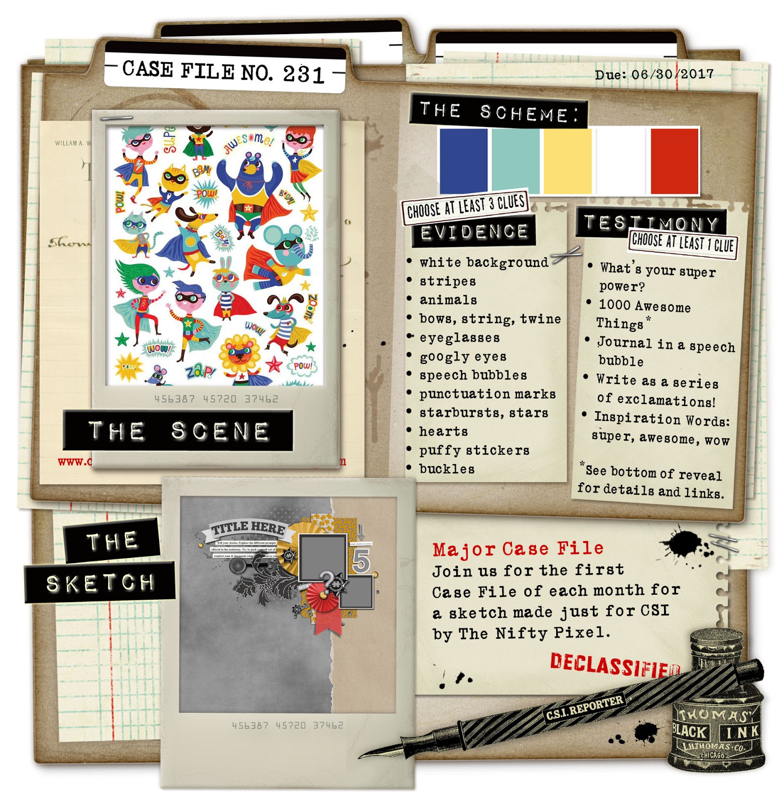
This month I debut as a "Detective" over at "CSI : Color, Stories, Inspiration!! That's right, I made the Design Team for a six - month term. And so, here's my first case as a design team member - #231 :
And here's what I created with it:
About 5 years ago my oldest and her best friend and cousin Sarah got together and we did a photo shoot here in Owen Sound at Morland Place. For extra fun, I invited a friend of mine who does photography on the side, and she took these great photos! When I first saw this combo I thought right away about these papers that I bought a couple of years ago from Reminisce. While I had the basics of the layout, I had some trouble finishing it up. I'm thankful for all the great suggestions from the design team and really love how this page turned out.
And here's how I solved the case:
COLOURS & SKETCH
All of the colours are there. I LOVED these bright primary colours this time! I tried to follow the sketch, adding in a third picture to the design.
EVIDENCE
Solid white cardstock background
Stripes (black diagonal)
Bows
String
Eyeglasses
Speech bubbles
Punctuation marks
Stars
Hearts
TESTIMONY
I chose the presentation prompt - Write your story in a speech bubble, and also the inspiration word "super".
Here's some detail shots:
This photo is a closeup of the journaling. I printed it on white cardstock centered the wooden speech bubble around it, and then used my Exacto knife to cut the rest of the cardstock away. The speech bubble is popped up, and the dark blue strip of paper & main photo are as well.
Here's a closeup of the title block - every time I read it, I start singing the song "Super Freak" in my head.......
In trying to decide how to finish the page, some of the other DT Members suggested paint splatters, which I loved the idea of but when I looked, I had no paint left. Instead, I tried doodling in pencil some funky straight lines on the corners, trying to make it look a bit "comic booky". Then I went over those pencil lines with a thin black marker, erasing the pencil lines after, and I am in love with the result!!
And finally, this photo shows the lower right hand corner of the layout. Here also was another suggestion from the DT members - messy thread under the wood circle. I've never done this before, but I definitely love the texture it adds to the page!!
Thanks for popping by to check out my page today! I hope you join us over at CSI - this case is open until June 30th so you have lots of time to participate and be eligible for some really great prizes!
This month I debut as a "Detective" over at "CSI : Color, Stories, Inspiration!! That's right, I made the Design Team for a six - month term. And so, here's my first case as a design team member - #231 :
And here's what I created with it:
About 5 years ago my oldest and her best friend and cousin Sarah got together and we did a photo shoot here in Owen Sound at Morland Place. For extra fun, I invited a friend of mine who does photography on the side, and she took these great photos! When I first saw this combo I thought right away about these papers that I bought a couple of years ago from Reminisce. While I had the basics of the layout, I had some trouble finishing it up. I'm thankful for all the great suggestions from the design team and really love how this page turned out.
And here's how I solved the case:
COLOURS & SKETCH
All of the colours are there. I LOVED these bright primary colours this time! I tried to follow the sketch, adding in a third picture to the design.
EVIDENCE
Solid white cardstock background
Stripes (black diagonal)
Bows
String
Eyeglasses
Speech bubbles
Punctuation marks
Stars
Hearts
TESTIMONY
I chose the presentation prompt - Write your story in a speech bubble, and also the inspiration word "super".
Here's some detail shots:
This photo is a closeup of the journaling. I printed it on white cardstock centered the wooden speech bubble around it, and then used my Exacto knife to cut the rest of the cardstock away. The speech bubble is popped up, and the dark blue strip of paper & main photo are as well.
Here's a closeup of the title block - every time I read it, I start singing the song "Super Freak" in my head.......
In trying to decide how to finish the page, some of the other DT Members suggested paint splatters, which I loved the idea of but when I looked, I had no paint left. Instead, I tried doodling in pencil some funky straight lines on the corners, trying to make it look a bit "comic booky". Then I went over those pencil lines with a thin black marker, erasing the pencil lines after, and I am in love with the result!!
And finally, this photo shows the lower right hand corner of the layout. Here also was another suggestion from the DT members - messy thread under the wood circle. I've never done this before, but I definitely love the texture it adds to the page!!
Thanks for popping by to check out my page today! I hope you join us over at CSI - this case is open until June 30th so you have lots of time to participate and be eligible for some really great prizes!
Monday, April 17, 2017
CSI #228 - Happy Together
I'm back again with another great case from CSI : Color, Stories, Inspiration. Here's the case file:
This colour combo is a great one - and I LOVE the scene photo! I really want that living room in my house. It feels kinda summery and light, doesn't it?
And, here's the layout that I created.
Last summer we celebrated my parents 45th wedding anniversary with them at the "home farm". Part of the celebration weekend included updating our family photos. This layout showcases a few of the photos that were taken of my family during that time.
And here's how I solved the case :
COLOURS
All of the colours are there.
EVIDENCE
Solid Background
Arabesque shape
Frame
Monogram
Branches/Flowers
Embossing folder - I did not use a folder but did use an embossed solid white cardstock as my base. The embossing pattern reminded me of the photo frames/mirrors in the scene photo.
Silver Metal
TESTIMONY
I used the April question prompt
#9. _______ makes me happy
#11. List the people you live with
And also used the inspiration word "home".
The journaling reads as follows:
Richard, Renee, Ethan, and Erica
Spending time with you makes me so very happy.
Wherever we are together, that is home.
I love you all.
04 . 17 . 2017
All the photos on the layout were taken by Danielle of Vallis Photography.
And here's some detail shots:
This photo shows the title work a little closer. I've had those flower stems (I think they're Prima) for a long time. I'm not usually a flower girl but I loved them when I saw them. After bringing them home though, I couldn't figure out how to make them look good on a layout until now. I really like them here. Also here you can see the "16" highlighted by the belt buckle - that's a play on the year that the photos were taken. Once again, I pulled my mini stapler into service, and discovered that you can staple wooden hearts with it. Speaking of which have you ever seen wooden hearts so TINY?? I love them!
This photo shows the left hand side of the layout. I really loved this family photo - it's an outtake, and I'm pulling a funny face, but truly shows what every family photo shoot ends up like for us. Love that our photographer captured the "real" for us.
And finally, this photo is showing the fussy cut arabesque shape at the top right of the layout. I cut out a second middle piece and then popped it up for a little dimension.
As I look back at my pages, I'm noticing that a few things always seem make it on to my layouts - I always have a bow or knot, always have something metal, always pop something up, and usually have something fussy cut. How about you? Is there something that you always do or a signature element that you always include?
Thanks for popping by to check out my page today!
This colour combo is a great one - and I LOVE the scene photo! I really want that living room in my house. It feels kinda summery and light, doesn't it?
And, here's the layout that I created.
Last summer we celebrated my parents 45th wedding anniversary with them at the "home farm". Part of the celebration weekend included updating our family photos. This layout showcases a few of the photos that were taken of my family during that time.
And here's how I solved the case :
COLOURS
All of the colours are there.
EVIDENCE
Solid Background
Arabesque shape
Frame
Monogram
Branches/Flowers
Embossing folder - I did not use a folder but did use an embossed solid white cardstock as my base. The embossing pattern reminded me of the photo frames/mirrors in the scene photo.
Silver Metal
TESTIMONY
I used the April question prompt
#9. _______ makes me happy
#11. List the people you live with
And also used the inspiration word "home".
The journaling reads as follows:
Richard, Renee, Ethan, and Erica
Spending time with you makes me so very happy.
Wherever we are together, that is home.
I love you all.
04 . 17 . 2017
All the photos on the layout were taken by Danielle of Vallis Photography.
And here's some detail shots:
This photo shows the title work a little closer. I've had those flower stems (I think they're Prima) for a long time. I'm not usually a flower girl but I loved them when I saw them. After bringing them home though, I couldn't figure out how to make them look good on a layout until now. I really like them here. Also here you can see the "16" highlighted by the belt buckle - that's a play on the year that the photos were taken. Once again, I pulled my mini stapler into service, and discovered that you can staple wooden hearts with it. Speaking of which have you ever seen wooden hearts so TINY?? I love them!
This photo shows the left hand side of the layout. I really loved this family photo - it's an outtake, and I'm pulling a funny face, but truly shows what every family photo shoot ends up like for us. Love that our photographer captured the "real" for us.
And finally, this photo is showing the fussy cut arabesque shape at the top right of the layout. I cut out a second middle piece and then popped it up for a little dimension.
As I look back at my pages, I'm noticing that a few things always seem make it on to my layouts - I always have a bow or knot, always have something metal, always pop something up, and usually have something fussy cut. How about you? Is there something that you always do or a signature element that you always include?
Thanks for popping by to check out my page today!
Sunday, March 19, 2017
A Great Day to Fly - CSI Major Case #225
I'm back again with another page created for CSI : Color, Stories, Inspiration. I'm always thankful for the way Debbi tries to push us to make our pages more meaningful by including the story behind the photos. And the combos?? Gorgeous!
Here's the case file for this combo. It's is open until the end of the month, so there's still plenty of time to come play along!!
Here's my layout :
And here's how I solved the case :
COLOURS AND SKETCH
All of the colours are there - and I loved them all! Red, blue and yellow?? HEAVEN. I had enough photos to make a 12x24 layout this time. I tried to incorporate the sketch a little on the left-hand side of the page but kind of mirror-flipped it if that makes sense.
EVIDENCE
Stars
Washi tape - the blue plaid pattern on the red strips around the page
Things that fly
Triangles
Circles
Wings
TESTIMONY
Journal about an adventure and the inspiration word "fly"
The journaling reads as follows :
In April of 2015, Dad bought a sightseeing flight from Owen Sound Flight Services at Timothy Christian School's annual fundraising auction. He decided that he would treat his 5 oldest grandchildren to an awesome experience. In fact, for 2 of the 6 passengers, it was the first time ever on a plane! But there isn't enough room for 5 people in a Cessna 172. Dad solved that problem by buying an extra sightseeing flight, and that made room for 6 people. So, the three oldest granddaughters went up first, and then Dad joined his grandsons for the second flight. Renee took pictures during the girls flight, but they were lost when she switched phones. As a result, all the photos on this page, with the exception of one, were taken by Dad. I think one of the best photos is the one taken while the pilot was flying over the "home farm". The whole afternoon made for an extra special experience indeed.
And, as always, here's some close ups of the page.
I popped up the letters for the word "FLY", which I punched from a patterned paper.
All the stars are cork - a really fun texture to add to a page. Here you can see where I used my old Heidi Swapp Edge Distresser - I distressed all of the circles which I rough cut from a different patterned paper.
The small picture is popped up - that's my son and my nephew with the pilot. Also here you can see the canvas wings, and where I used my new Tiny Attacher for an interesting design element. (plus I just really wanted to give it a go - LOVE how easy it is to use!)
This photo shows the property where I grew up - the pilot flew over it and my Dad snapped this great photo! In it you can see the HUGE garden (to the left side of the houses) that my parents plant every year. When we were growing up Mom put a lot of the produce that we grew into the freezer and we ate from it all year long.
This photo shows my current home from the air (top left hand side). It's turned out to be unplanned but special that I have a bit of "then & now" documentation going on on this page.
Thanks for popping by today to check out my page!!
Here's the case file for this combo. It's is open until the end of the month, so there's still plenty of time to come play along!!
Here's my layout :
And here's how I solved the case :
COLOURS AND SKETCH
All of the colours are there - and I loved them all! Red, blue and yellow?? HEAVEN. I had enough photos to make a 12x24 layout this time. I tried to incorporate the sketch a little on the left-hand side of the page but kind of mirror-flipped it if that makes sense.
EVIDENCE
Stars
Washi tape - the blue plaid pattern on the red strips around the page
Things that fly
Triangles
Circles
Wings
TESTIMONY
Journal about an adventure and the inspiration word "fly"
The journaling reads as follows :
In April of 2015, Dad bought a sightseeing flight from Owen Sound Flight Services at Timothy Christian School's annual fundraising auction. He decided that he would treat his 5 oldest grandchildren to an awesome experience. In fact, for 2 of the 6 passengers, it was the first time ever on a plane! But there isn't enough room for 5 people in a Cessna 172. Dad solved that problem by buying an extra sightseeing flight, and that made room for 6 people. So, the three oldest granddaughters went up first, and then Dad joined his grandsons for the second flight. Renee took pictures during the girls flight, but they were lost when she switched phones. As a result, all the photos on this page, with the exception of one, were taken by Dad. I think one of the best photos is the one taken while the pilot was flying over the "home farm". The whole afternoon made for an extra special experience indeed.
And, as always, here's some close ups of the page.
I popped up the letters for the word "FLY", which I punched from a patterned paper.
All the stars are cork - a really fun texture to add to a page. Here you can see where I used my old Heidi Swapp Edge Distresser - I distressed all of the circles which I rough cut from a different patterned paper.
The small picture is popped up - that's my son and my nephew with the pilot. Also here you can see the canvas wings, and where I used my new Tiny Attacher for an interesting design element. (plus I just really wanted to give it a go - LOVE how easy it is to use!)
This photo shows the property where I grew up - the pilot flew over it and my Dad snapped this great photo! In it you can see the HUGE garden (to the left side of the houses) that my parents plant every year. When we were growing up Mom put a lot of the produce that we grew into the freezer and we ate from it all year long.
This photo shows my current home from the air (top left hand side). It's turned out to be unplanned but special that I have a bit of "then & now" documentation going on on this page.
Thanks for popping by today to check out my page!!
Sunday, February 12, 2017
I'm on a Roll !!!
I'm finally feeling like the dry spell might be over - my 3rd page in a month?? WHAT?
Anyways, here's the latest case from Color, Stories, Inspiration - isn't it great? These colours are some of my favorites!
Here's my layout :
And here's how I solved the case :
COLOURS & SKETCH
All the colours are there. The photos make the red look more orange, but IRL, they are very very close. Consistently dull weather here in Ontario isn't helping much either. While I liked the sketch, I found that the subject of this page didn't work well with it.
EVIDENCE
Stripes - blue patterned paper
Trees
Food - a stretch maybe, but I'm counting the silverware on the left side of the page for this clue
Animals - the foxes on the title tag
Pleats - red patterned paper on the right
Transparent Stuff - clear tag on the title tag
Fabric - the date tag is made of a jean-like fabric
TESTIMONY
Journal about a meal
This page isn't really about a meal per say, rather it documents my feelings about how little time we're spending around the table eating meals together as a family. The journaling is as follows:
when i was a kid, almost every meal was eaten around the kitchen table. the six of us ate dinner together just about every night. my dad started each meal with a prayer of thanksgiving and ended them with a time of family devotion.
this table - purchased second hand almost 20 years ago when we were young and full of dreams.
this table - so many stories and meals and so many memories created together around it.
this table - fewer and fewer meals are being eaten at it as a family of five - someone is leaving for college soon, another one working, and evening activities seem to be taking up this precious time together.
i miss being here - around this table.
february 5, 2017
Here's some detail shots :
This photo shows the title work. The little card with the foxes is actually from the packaging of a bookmark I bought last year. Those foxes are so super cute and just the right colours, so I couldn't resist using it on this layout. I love it when non-scrapbooking items that I am inspired by are able to be part of my pages.
This is the little cluster at the top left hand side of the page. I fussy cut the flowers out and stacked them using some pop dots to add dimension. I tried to make sure that all the colours in the combo were in this cluster as well.
This photo is showing the pleating on the right hand side of the page. I actually used 2 strips of paper, hiding the seam under the photo.
Thanks for stopping in and checking out my page today!
Anyways, here's the latest case from Color, Stories, Inspiration - isn't it great? These colours are some of my favorites!
Here's my layout :
And here's how I solved the case :
COLOURS & SKETCH
All the colours are there. The photos make the red look more orange, but IRL, they are very very close. Consistently dull weather here in Ontario isn't helping much either. While I liked the sketch, I found that the subject of this page didn't work well with it.
EVIDENCE
Stripes - blue patterned paper
Trees
Food - a stretch maybe, but I'm counting the silverware on the left side of the page for this clue
Animals - the foxes on the title tag
Pleats - red patterned paper on the right
Transparent Stuff - clear tag on the title tag
Fabric - the date tag is made of a jean-like fabric
TESTIMONY
Journal about a meal
This page isn't really about a meal per say, rather it documents my feelings about how little time we're spending around the table eating meals together as a family. The journaling is as follows:
when i was a kid, almost every meal was eaten around the kitchen table. the six of us ate dinner together just about every night. my dad started each meal with a prayer of thanksgiving and ended them with a time of family devotion.
this table - purchased second hand almost 20 years ago when we were young and full of dreams.
this table - so many stories and meals and so many memories created together around it.
this table - fewer and fewer meals are being eaten at it as a family of five - someone is leaving for college soon, another one working, and evening activities seem to be taking up this precious time together.
i miss being here - around this table.
february 5, 2017
Here's some detail shots :
This photo shows the title work. The little card with the foxes is actually from the packaging of a bookmark I bought last year. Those foxes are so super cute and just the right colours, so I couldn't resist using it on this layout. I love it when non-scrapbooking items that I am inspired by are able to be part of my pages.
This is the little cluster at the top left hand side of the page. I fussy cut the flowers out and stacked them using some pop dots to add dimension. I tried to make sure that all the colours in the combo were in this cluster as well.
This photo is showing the pleating on the right hand side of the page. I actually used 2 strips of paper, hiding the seam under the photo.
Thanks for stopping in and checking out my page today!
Friday, January 20, 2017
CSI : Case #222
Another case finished!!
Here's the beautiful case that was revealed January 15.
This case is open until January 31 so come on out and play!!
And here's what I came up with!
This is page for a friend - this cutie is her little guy.
Isn't he just SO sweet????
I loved this picture when I saw it and feel like the colours in this combo suited it very well.
COLOURS
All the colours are there.
EVIDENCE
Floral Pattern
Chevrons - red patterned paper under the photo
Snowflakes & Stars
Jewels & Pearls - I added 2 jewel beads to the star stick pin
Something fuzzy - the red letters in my title and the pom pom trim are both fuzzy
Ribbons and Bows
Flowers & Leaves - fussy cut under the title work
Stamps & Rub ons - the date stamp and the frame rub on around the photo
Glitter - the button on the large snowflake & the fussy cut flowers under the title are both glittery, although it's hard to see.
TESTIMONY
Document something about winter
Here's some detail shots :

Here, I layered and rolled 2 patterned papers to make the corner and layered on a clear black snowflake die cut as well.

This shot shows the title work - I wanted to have the title reflect the story which is why the N & the O are red.
And finally, this shot shows the large snowflake again as well as the rub-on frame that I added around the photo.
CSI never ceases to be an awesome source of inspiration for me!
You should pop over and give any of the fabulous combos a try!!
CSI : Color, Stories, Inspiration
Thanks for popping by to have a peek at my page!
Here's the beautiful case that was revealed January 15.
This case is open until January 31 so come on out and play!!
And here's what I came up with!
This is page for a friend - this cutie is her little guy.
Isn't he just SO sweet????
I loved this picture when I saw it and feel like the colours in this combo suited it very well.
COLOURS
All the colours are there.
EVIDENCE
Floral Pattern
Chevrons - red patterned paper under the photo
Snowflakes & Stars
Jewels & Pearls - I added 2 jewel beads to the star stick pin
Something fuzzy - the red letters in my title and the pom pom trim are both fuzzy
Ribbons and Bows
Flowers & Leaves - fussy cut under the title work
Stamps & Rub ons - the date stamp and the frame rub on around the photo
Glitter - the button on the large snowflake & the fussy cut flowers under the title are both glittery, although it's hard to see.
TESTIMONY
Document something about winter
Here's some detail shots :
Here, I layered and rolled 2 patterned papers to make the corner and layered on a clear black snowflake die cut as well.
This shot shows the title work - I wanted to have the title reflect the story which is why the N & the O are red.
And finally, this shot shows the large snowflake again as well as the rub-on frame that I added around the photo.
CSI never ceases to be an awesome source of inspiration for me!
You should pop over and give any of the fabulous combos a try!!
CSI : Color, Stories, Inspiration
Thanks for popping by to have a peek at my page!
Thursday, January 5, 2017
Um, it's only been 5 years.....
I cannot believe that it's been FIVE years since I posted on this blog.
That is ridiculous!! I want to be able to say that it will get better, but I like to try and be honest. I hope to be posting somewhat more regularly in the future.
Many of you that have read this blog before know that I play along over at a Ning page called CSI : Color, Stories, Inspiration. Recently, Debbi, the owner of the site, has moved the whole community over to Blogger and now I have a real excuse to begin using this blog again.
I think that posts will be mostly about my crafty pursuits, with a few tidbits of life thrown in for comic relief.
So 2017 over at CSI begins with this great combo, Major Case # 221. Here's a photo of the Case File :
I am not usually a lover of pink.
Actually, I really hate trying to create with pink.
Plus my mojo has been on vacation for about 4 months.
But I really love playing along with CSI.
So, a problem with no easy solution forthcoming.
Enter my scrappy friend with littles!!
We recently had a conversation about being crafty over Facebook Messenger and she lamented about not having the time to scrapbook anymore with small people in the house. So I offered to make a page for her, as I have no photos that currently inspire me. She finally took me up on the offer and, TA-DA!!! Here's the result :
COLOURS
All the colours in the combo are there. However, I think that I have about 5 different shades of pink. One of them has GOT to be close!! I tried to incorporate the sketch a little. While not exact, the outlines of it are there. I really like using a sketch to help get a page started.
EVIDENCE
Tiny dots - the brown background paper is a small dot print
Triangles & Circles
String
Different coloured letter stickers
Stamped phrase - I'm not sure this one counts as it's just a date stamp, but I'm claiming that clue anyways.
Pleats - the pre-pleated paper at the top left hand side of the page
Leaves - in the fussy cut flowers on the lower left hand side of the page
TESTIMONY
This page documents this littles 2nd birthday "Paintsplash" photo session. Isn't she just the cutest 2 year old EVER???
Here's some detail shots of this layout that I wanted to share :
These two shots show how 3D those fussy cut flowers are. I love using pop dots to give a page dimension! The largest photo is also popped up off the page.
And just a few more closeups on the details of the page.
I loved learning her nickname and chose to incorporate it into the title. I also added the date stamp (from Heidi Swapp) to the sticker over the largest photo. And, lastly, the little pleated paper trim cluster at the top of the page.
If you've never played along over at CSI, you should totally give
it a try! Here's a link : Color, Stories, Inspiration
Thanks for popping by to see my page today!
That is ridiculous!! I want to be able to say that it will get better, but I like to try and be honest. I hope to be posting somewhat more regularly in the future.
Many of you that have read this blog before know that I play along over at a Ning page called CSI : Color, Stories, Inspiration. Recently, Debbi, the owner of the site, has moved the whole community over to Blogger and now I have a real excuse to begin using this blog again.
I think that posts will be mostly about my crafty pursuits, with a few tidbits of life thrown in for comic relief.
So 2017 over at CSI begins with this great combo, Major Case # 221. Here's a photo of the Case File :
Actually, I really hate trying to create with pink.
Plus my mojo has been on vacation for about 4 months.
But I really love playing along with CSI.
So, a problem with no easy solution forthcoming.
Enter my scrappy friend with littles!!
We recently had a conversation about being crafty over Facebook Messenger and she lamented about not having the time to scrapbook anymore with small people in the house. So I offered to make a page for her, as I have no photos that currently inspire me. She finally took me up on the offer and, TA-DA!!! Here's the result :
COLOURS
All the colours in the combo are there. However, I think that I have about 5 different shades of pink. One of them has GOT to be close!! I tried to incorporate the sketch a little. While not exact, the outlines of it are there. I really like using a sketch to help get a page started.
EVIDENCE
Tiny dots - the brown background paper is a small dot print
Triangles & Circles
String
Different coloured letter stickers
Stamped phrase - I'm not sure this one counts as it's just a date stamp, but I'm claiming that clue anyways.
Pleats - the pre-pleated paper at the top left hand side of the page
Leaves - in the fussy cut flowers on the lower left hand side of the page
TESTIMONY
This page documents this littles 2nd birthday "Paintsplash" photo session. Isn't she just the cutest 2 year old EVER???
Here's some detail shots of this layout that I wanted to share :
These two shots show how 3D those fussy cut flowers are. I love using pop dots to give a page dimension! The largest photo is also popped up off the page.
And just a few more closeups on the details of the page.
I loved learning her nickname and chose to incorporate it into the title. I also added the date stamp (from Heidi Swapp) to the sticker over the largest photo. And, lastly, the little pleated paper trim cluster at the top of the page.
If you've never played along over at CSI, you should totally give
it a try! Here's a link : Color, Stories, Inspiration
Thanks for popping by to see my page today!
Subscribe to:
Posts (Atom)