No, seriously, we really need it to rain. Our area is SO dry, that we are now under a total burn ban - no fires for anything, not even cooking! If we were camping that would be a bummer since s'mores are a summer must-have around here.
The middle of July also brings another new case from CSI : Color, Stories, Inspiration!! Since it is summer, it fits right in with it's beachy inspiration photo.
Here's the freestyle prompts:
And the traditional colour scheme and clues:
EVIDENCE
Stripes
Watercolor pattern
Sketchy patterns
Beach/nautical elements
Lobster or other animal
Cards
Glasses
Circles
Wet medium
Embossing powder or something else grainy like sand.
Sun
Fringe
Elements from the Scene, like candy, ice cream, bikini, shells, pail, beach ball, etc.
TESTIMONY (JOURNALING IDEAS)
Topic: Document a trip to the beach or other place near water.
Prompt Idea: Choose a July question.
Presentation: Add journaling to stripes on your paper.
Writing Format: Write a list of things you need to bring to whatever event is in your photo.
Inspiration Words: relax, entertain, away
THE SCHEME (RGB Codes)
114.191.211 – bright sky blue
71.94.144 – navy blue
255.255.251 – white
238.79.39 – red with a hint of orange
246.239.221 - sand
And here's what I made with it :
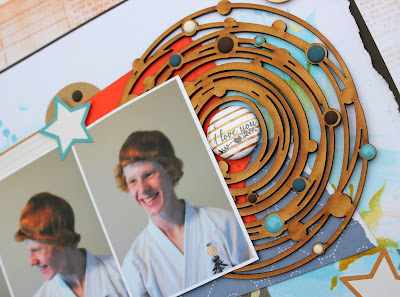
These series of photos were outtakes from a quick passport style photo shoot we did at home for my son so he could add his picture to his black belt certificate. The certificate itself is very large (about 16x20 or so) and it's traditional to have your photo on there. But we poked a little fun at him while we were doing it and that's how I managed to capture these pictures. The photos themselves are blurry and a little out of focus, but I still love how they show his easy smile, so I chose to use them. I challenge you to use your "less than perfect" photos on your next creation!
Here's how I solved this case:
COLOURS
All the colours are there, with the addition of two hues of brown, and a little bit of kraft. The darker hue of brown was prompted by the background of the patterned paper with the numbers on it, and the lighter one by the large wooden circle piece. I used that shade as inspiration for the stenciled circles on the background as well.
EVIDENCE
Stripes (on the ribbon, which was inspired by the umbrella)
Watercolour pattern (background)
Circles
Stars (inspired by the white starfish on the left hand side)
TESTIMONY
I chose to use the Presentation prompt this time, and printed my journaling on stripes of paper. I used the RGB codes to get just the right shade of orange for the type.
Journaling
your smile is infectious
your laugh is easy, loud, and then goes silent with whooping breaths
you are sarcastically funny
never stop laughing, my son
i love you.
Here's a few closeups:
This is the large wooden circle piece behind the photos. Originally, I had thought to paint it white, but I really liked it just the way it was. To add interest to the piece, I randomly added a mix of matte and glossy enamel dots in the colours of the combo, and in the brown that I added. The badge in the middle is from one of our sponsors - Accents by Kareen. She has some really great pieces and I would encourage you to check out her shop! The watercolour stripes on the background of the badge perfectly matched the colour of the wood.
Here's my title work a little closer. The "Hey There" tag came from a set of brads by Basic Grey - the Persimmon collection. The colours in it were perfect for the combo! The "I love your" sticker is actually 2 different ones patched together. The "I love you" was the first piece, and I cut the "r" off another sticker that said "forever" and hid the seam under the "L" in the acrylic "smile" word. I added a kraft circle to draw the eye, and 2 stars plus another matte enamel dot finished it off.
This little cluster is from the top right hand corner of the page. I started by folding the corner down and back, and then layered on a wooden circle, a clip, and the "awesome" flag. Then I added the tab sticker in the back to tie in all the colours of the combo.
I've started trying to stamp the date on my scrapbook pages, but sometimes I don't want it to be really noticeable, or I don't know where to add it to the design. I know that I can always stamp on the back, but my sister suggested stamping in white. I tried it with a scrap piece of brown cardstock first, and LOVED how it looked! So it's not super obvious that it's there, but the date is part of the design. I'll probably do this again in the future.
And, finally, here's my journaling stripes. When I first put them down they seemed to get a little lost on the page. My sister suggested inking the edges, or popping the strips. I did try the inking, and you can see it there on the "I love you" strip. I could have re-printed the journaling to get rid of the inking but I counted this as my happy accident on this layout, since it highlights the words that have the most meaning. I liked the way popping up the strips made the journaling more subtlety obvious, so I did that instead.
Thanks for popping by and checking out my page today! Don't forget that we have THIRTEEN sponsors this month, but in order to qualify for prizes, you have to play! You can check out our July 2018 sponsors HERE. I can't wait to see your creations!!


